Comparison

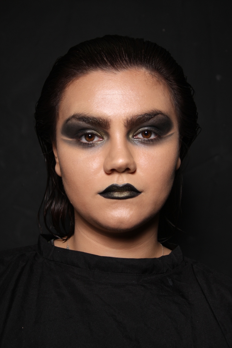
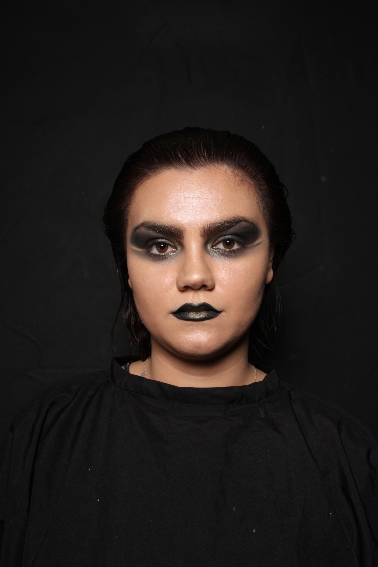
Here I have placed the images of both my continuity shoots next to each other. I am really pleased with the outcome, although I notice some slight changes. The main differences in the images are definitely the flicks. I think on the second shoot, the flicks are slightly lower and a little darker. I think that this is most noticeable on the face forward images. I think that also I may have brought the black eyeshadow up a little too high by the brows in the second series of images, but I don’t know if that it true as I have noticed that the lighting is just ever so slightly different, the second series of images are a tad darker than the first. I tried to copy the settings on the camera, but I think that maybe the light was on a different setting, which I didn’t change. I also think I may have sat my model too far back, which could be why the images appear slightly darker. It is not as noticeable in the close up photographs, which makes me think that it may be the positioning. Another thing that I would change would be to wet the hair down a little more in the second shoot, as I think that the hair was too dry which made it appear lighter and less slicked back.

Apart from this, I am pleased that I have completed both continuity assessments. I think that my time management was good, and that I did not over-stress about the assessment.


Technical: Continuity Assessment 2. (Timed Assessment)

These are the images from my continuity assessment. I am really happy of how the assessment turned out, and I managed to complete the look once again in the time frame we were given. I was a little more nervous about how this look was going to come out the second time, and I did have to spend a little more time blending the eye shadow as I wanted the shade and shape to be the same as the first time. I think I did well making the look again, and I think I managed to get the same look twice, but I will complete another blog post comparing the two images together. I think in this look, the flick is a little more heavier than the first time, which is something I definitely would have changed if I were to do the look again.


IMG_9965IMG_9963


Technical: Continuity Assessment No.1

Health and Safety-

  • All products and equipment are to be sanitised.
  • Clean surfaces are a must, to remove any chance of contamination.
  • Complete a full consultation of the client to be made known of any infections and allergies.
  • Cover the client in a cape to make sure no products come into contact with their clothing.
  • Wash hands.
  • Hair up and no jewellery so that it does not catch or interfere with the model.


Products and Equipment –

  • Cleanser, Toner and Moisturiser.
  • Kryolan UltraFoundation Palette.
  • Illamasqua Radiance Veil.
  • Illamasqua Radiance Veil.
  • Kryolan Camouflage Concealer Palette.
  • Illamasqua Translucent Powder.
  • Illamasqua Sculpting Powder Duo.
  • Kryolan GlamourGlow Palette.
  • Illamasqua Neutral Palette.
  • Kryolan SupraColour.
  • Mascara.
  • Black Lipmix.
  • MAC Fix+.
  • Brushes.
  • Cotton Pads+Baby Buds.
  • Water Spray.
  • Hair Straighteners.
  • Heat Protector.
  • Paddle Brush.
  • Sectioning Clips.
  • Pintail Comb.


Method:

Makeup.

  1. Prep the skin, by cleansing, toning and moisturising.
  2. Prime the face with Illamasqua HydraVeil.
  3. Apply the matching shade of UltraFoundation to the centres of the model’s face, and buff outwards.
  4. Conceal any blemishes using the Camouflage Palette.
  5. Apply Radiance Veil to the cheekbones, chin, cupid’s bow, bridge of the nose, forehead and brow bones.
  6. Powder the areas that you do not want to have shine, such as the areas around the nose, sides of the forehead.
  7. Enhance the highlight further by applying the Glamour Glow to the high areas of the face.
  8. Contour the face using the Sculpting Powder Duo.
  9. Fill in the brows using the Neutral Palette’s Brown tone.
  10. Brush Radiance Veil through the brows, leaving no clumps.
  11. Apply the GlamourGlow to the eyelids, then layer black over, and blend out past the temples.
  12. Line the bottom lid with black, and blend out into a flick away from the side of the eye.
  13. Apply the Gold Supra colour to the inner corners of the eyes.
  14. Apply a thin layer of mascara on the lashes.
  15. Using the Black LipMix, apply over the lips.
  16. Apply Gold Supra Colour to the centre of the lips.
  17. Spray with MAC Fix+.

Hair.

  1. Spritz the hair with heat protector.
  2. Straighten the hair.
  3. Spray the hair with water and comb backwards away from the face.


IMG_9951IMG_9944


These are my images from my first assessment. I am really pleased with how the look turned out, especially under the camera. I think that I had the correct lighting for these photographs, as the makeup is clear, and not too dark, which I was initially worried about because the makeup is so dark itself. I am pleased that I managed to take a range of photographs, as I find I always have to take way more than what is needed so that I have a good variety to choose from. I think that by using the cape to cover my model’s clothes was a good choice, as in my film my model will be wearing black, and this makes the continuity simpler. I managed to complete the look within the time frame, which I was pleased about. I managed to complete the look much more quickly than I expected, I think this is due to the fact that I have practised this look before the assessment. I am pleased with how the look comes out on camera, and the highlight is very dewy and exactly what I wanted. I would, however like to have changed one thing about the look. I think that I should have used gel to slick the hair back rather than water, just so that my model’s hair did not move when taking the photos. I think this would have made the hair look a lot more slicker. I was surprisingly less stressed about this timed assessment compared to last year, I think this was mainly down to the fact that I have already done timed assessments, whereas last year I was new to the whole concept. I am excited to complete the second half of my continuity as I think I have followed my face chart and notes very well, making it easier to recreate next time.


Technical: Film Make-up Practice

Here I have practised the make-up that I would like to use in my film. This was mainly just a test to see how the makeup that I had designed on paper would look on the face. I am really pleased with the outcome of the makeup, I think that it suits my theme and mood of my film. As my film revolves around the feeling of being trapped, I wanted the makeup to be very dark. I have decided that the main colours in my film are to be black, white and gold, so a very limited palette will be used in the makeup look. I think that if I had chosen gold eyes for the makeup, this would not have had the desired effect, as the black draws in the eye, and is a more sombre and unhappy colour. Initially when thinking about the makeup, I was going focus on much more of a softer smokey eye, but I felt this was not dramatic enough. As I imagined my film to be very abstract, especially the shoots in the studios, I wanted the makeup to re-inforce that idea, so I added on the flicks at the bottom of the eyes, which make it look more sci-fi and sharp. I decided that the lips were to match the sharpness of the eye flicks, so I chose black lipstick which was applied with a liner brush, to make sure that the line was very clean. I then added in the gold to the inner corners of the eyes and the centre of the lips and blended out. I think this brought the whole look together. I had trouble with making the dewy skin, mainly down to the products that I was using. I used the grease-based UltraFoundation Palette to even out the skin tone, then tried to buff in the Radiance Veil Highlighting Primer on top of this, but this made the foundation gather together creating an uneven base. I tried to start the skin again, and put the highlighter on first this time but I felt like the skin was not highlighted enough. I then worked out that if I tapped the highlighter into the skin, this made the highlight glowing and dewy, without ruining the base makeup. I topped up the highlight with the Sculpting Powder Duo and the Kryolan GlamourGlow Palette, so the skin was glowing and fresh. I didn’t go too extreme with the contour, as I didn’t want this to take away from the drama of the eyes. I brushed through the brows with the highlight, which I think was a good decision as this brought the whole look more together and completed the finishing touches. I sprayed over the skin with the MAC Fix+ spray, which left the skin fresh and dewy. I am pleased with the final outcome of this look, as I think it is really suitable to the theme of my mood. I think I would like the eyes to be a little more metallic looking, so I would like to try applying the highlight over the lids and then layer the black on top.


Health and Safety.

-Make sure products, brushes and equipment are sanitised and ready to use.

-All surfaces are to have been cleaned.

-No cross-contamination/double-dipping.

-Wear hair up, no jewellery as this can get caught during the makeup.

Products.

  • UltraFoundation Palette
  • Radiance Veil
  • Sculpting Powder Duo
  • GlamourGlow Palette
  • Translucent Powder
  • Skin Base Lift – 02
  • Illamasqua Neutral Palette
  • Supra Colour Gold
  • Black LipMix
  • MAC Fix+

Method.

  1. Prep the skin using cleanser, toner and moisturiser. The look is dewy skin so moisturiser is a must.
  2. Match the foundation to the model’s skin tone, and focus on applying it to the centre of the face, and buffing out using a buffing brush.
  3. Tap Illamasqua Radiance Veil into the tops of the cheekbones, forehead, bridge of nose, chip and cupids bow.
  4. Powder the areas that you do not want to be dewy, such as the creases of the nose, outsides of the chin and forehead, using the Translucent Powder. Powder under the cheekbones, so that the powder contour does not become uneven.
  5. Contour the cheeks, around the edges of the forehead and the nose.
  6. Layer on the GlamourGlow highlight and the sculpting powder duo highlight onto the cheekbones.
  7. Slightly fill in the brows, keeping the look natural, then brush in the Radiance Veil into them using a mascara wand. You only want to just coat the hairs, so no clumps.
  8. Work black eyeshadow from the neutral palette into the eye sockets, making the colour very prominent and dark on the lids, and blend outwards. Line the eye and blend out, creating the flicks with an angled brush.
  9. Apply gold supra colour into the inner corner of the eyes on both the top lid and bottom.
  10. Apply black LipMix using a small detailing brush, creating a slick line. Apply all over the lips.
  11. Apply the gold supra colour to the centre of the top and bottom lip.
  12. Spritz the skin with the MAC Fix+.


The Birds.

NQ_26Birds1

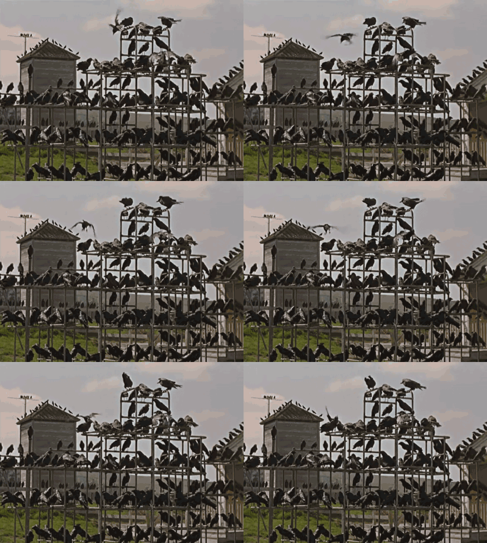
The Birds is considered Hitchcock’s last great movie, but also as an end to the build up through his other movies. Birds are used as a consistent motif throughout Hitchcock’s films, particularly in the film previous to Birds, Psycho. The movie is based on the short story by Daphne Du Maurier, about a flock of birds that attack a small, idyllic, seaside town in England, causing devastation throughout. In Hitchcock’s version, the film is set in Bodega Bay and San Fransisco, and was filmed in 1963.

200_s

The most interesting concept in this film for me, was the unknown. There is no explanation for the bird attacks, and no resolution. I find this horrific in a way, as we are unable to help the situation at all, we cannot help to stop. Some people consider the film an apocalyptic film, and I can see clearly why. The birds’ attacks are consistent and never-ending, so people believe that this is the end of the world. The birds are interestingly not birds of prey, but they are everyday birds that flock to cities and towns across the UK and America. Gulls and Pigeons are the main culprits in the film, as they become manic and dive-bomb into buildings and people. It is undeniably a bizarre film, but taking something from everyday life and twisting it into something dark and harmful is terrifying. I can admit I have never looked at birds the same way after watching it. I don’t think that it would have had the effect it did on me if Hitchcock had used birds of prey, as they are creatures that we are not so open to, and don’t necessarily see often. The fact that it is just ordinary birds is scary because there are so many.

After completing some research, I found the reason behind the inspiration for the story of The Birds. It was in fact a real occurrence, but not on a deathly scale. Thousands of birds in Monterey Bay flew into the walls of buildings in the summer of 61, all dying as they hit the buildings. This must have been a really horrific experience, as technology was not as advanced, so they had to wait for the answer for quite a while, not knowing if this was going to occur again. The answer to the birds flying into walls was because they were disorientated, caused by a nerve-dancing toxin. In the film, we are left not knowing whether the birds are here because of a similar reason, or if it’s an apocalypse, a punishment for humankind.

Hitchcock uses many film techniques to increase the dramatic tension in the film. In the opening, the film is bright and colourful, leading the audience to feel relaxed and happy, wondering where the horror is going to come into it. This contrasts the ending of the film, which uses a lot of shadow, with a cold filter on the camera, and a lot more darker colours to create a mysterious and eerie feel to the film. Hitchcock uses the colour green to create a feeling of uncertainty, a trait that is used throughout most of his films. Many characters wear the colour, and the scenery at the beginning is full of lush green grass and trees, which sets the film up for the audience to not know what will happen. As the main two characters are in the bird shop, the birds here seem friendly, and not harmful. This also backs up this uncertainty for the viewer. I found the beginning of the film interesting because of this use of colour and lighting.
ALFRED HITCHCOCK (DIR) PORTRAIT O/S "THE BIRDS' (1963) ALH 007P
For my film, I want to try and use colour in the same way, symbolic for the audience. I think that this enhances the viewers experience watching the films. I would like to embrace black and white footage, as I believe this will seem like the dancer’s colour has drained out of her life. I think that the colouring will be of a limited palette, such as black and neutral, warm tones. Black is symbolic for power and control, and for me to use this colour in my film will symbolise how the dance has full control of the dancer. I think that this will be effective in enhancing the viewing experience, and boost their emotional connection to the film.

tumblr_m6ozuaLwxP1qcga5ro1_500


Wikipedia (no date) The Birds. Available at: https://en.wikipedia.org/wiki/The_Birds_(film) (Accessed: 10 December 2015).


Psycho.

Considered the mother of all modern horror films, Psycho is Alfred Hitchcock’s 1960 chilling, psychological thriller. It is believed that all modern ‘slasher’ films were born single-handedly from this film. The film is based on a novel, written by Robert Bloch, which revolved around a real life murderer in Wisconsin, who was arrested for taking people’s bodies apart. The part that took most people aback were the fact that there was intact two plot twists, one, being Marion being killed, the next, that the murderer who looks like a woman is actually a man. This exploration of gender also shocked the audiences, as at this time is was looked down upon for men to dress as women.

The film is most famous for the shower scene, which is reenacted in many films after it’s time.The idea of being wrongly accused is played with in this scene, as it is after Marion, a thief, has given back the money she has stolen, in order to suffer the consequences. She knows that she is wrong, and accepts that there will be consequences of her actions. But, before Marion can be incarcerated, she is killed by woman (or so we are led to think). This idea of being accused of something that you’ve already put right reflects Hitchcock’s childhood, as this was a regular occurrence. I think that this really moulded Hitchcock as a person, hence why this is being tackled in many of his films.

Although that we do not actually see the knife being plummeted into Marion’s skin, it is suggested. We know that it happens, but Hitchcock leaves it to the audience’s imagination. This makes it more horrific for the audience, as we begin to imagine the blood and gore. Imagination is much worse than reality. The whole scene is played through in the killer’s point of view, which again shows Hitchcock’s ability to manipulate the audience. We feel guilty for Marion’s death, as we are put in the place of the killer itself, and we cannot stop it. The use of camera angles, quick paced editing, different shots and the juxtaposition of these enhances this experience for the viewer, as Hitchcock not only manipulates the viewer, but the film structure and language too.

The shower scene also explores the female, as a gender. Marion is a pretty and petite woman, who appears to be friendly. But she is a thief, and thieves must be punished, but then she hands back the money and accepts that she has done wrong. She is alone in the shower, and naked, so she appears extremely vulnerable. Although the killer seems to be a woman but is a man, we know that Marion will not be able to stand against a man attacking her from nowhere.

Looking at one of the most historically famous horror films has been very beneficial to my work. Although I am not looking at making a horror, I am looking at making a dark thriller, which explores the human psyche. It is good to watch a wide range of films when analysing film, because it expands your knowledge extensively.


Alfred Hitchcock.

Alfred Hitchcock was an English born movie director, who became one of the most well-known names in the industry. He was born in London, 1899, into a strict Catholic Family. His childhood was a lonely and sheltered one, which he claims was due to his obesity. His parents were hard on him, particularly his mother, who as a punishment, made him stand at the end of her bed for hours on end. This was an influence for his future films, as this is replayed in the film Psycho. Growing up, he took art courses at the University of London, and later became a draftsmen. He worked his way up, soon becoming an assistant director. During this time, he was always writing stories and submitting them to in-house publications. In 1929, he made his first thriller film. The thriller genre is what he is known best for to this day, and is considered one of the most influential people to grace the industry. In 1939, he left England, destined for Hollywood. Here, his first film ‘Rebecca’ won himself a Academy Award for Best Picture. His films often tackle the idea of being wrongly accused, (a common occurrence in his childhood), as well as depicting violence in a way no other director could manage. He became known for his ingenious camera shots and angles, as well as symbolism, gender and above all, his ability to create such suspense in his films. I have seen two of his films, Psycho and Birds, and I can say I have very much enjoyed them. I think that it is important to look at directors both past and present, as you begin to see the common traits that has developed through the times. I think that it is important to also look at the director’s background and childhood, as like Hitchcock, many of their movies tackle certain themes that revolve around their experiences.

Berg, C. R. (no date) Alfred Hitchcock – A Brief Biography. Available at: http://hitchcock.tv/bio/bio.html (Accessed: 10 December 2015).

Dance Fashion Films.

After watching ‘Behind the Move’, I thought that it would be interesting to look at other fashion films that contained dance, or explored dance. I knew that by looking at other films that contained dance, it would benefit me to see how other directors were exploring this theme. I chose to look on both ShowStudio, and Vimeo. I find that these two sites contain a large selection of fashion films, and I knew that I would be able to find a selection of films that would explore dance.

First, I came across ‘Film’, a short film that was originally made to showcase a fashion student, Jo Watson’s, costume design. The designs were based on the story of a ballet dancer, Guiseppina, who was a dancer in the famous show,  Coppelia in France. This was at a time when France declared war on Russia, and as the ballet closed due to the war, she was living on the streets. She became ill, and died on her 17th birthday. The costumes reflect this story, and there is much focus on the pieces in the film. The film is well filmed, using a range of shots, including wide angles, mid shots, close ups and extreme close ups. I think that the use of these four shots in particular make the film disjointed, which is reinforced by the choice of music. The music originally sounds like it belongs in a ballerina trinket box, but then the music starts to jump, making it seem a bit menacing and ghostly. This is portrayed in the footage as well, as the ballerina in the film twirls round over and over again, and her clothes begin to get darker, and more military like. The film ends as the ballerina stretches out on the floor, which to me reflects how the ballerina is dying. I think that this is an interesting take on dance, as it is telling a story through the dance, whereas the work of Kendy Ty was telling the story behind the dance.


The next film that I came across was a film called ‘Funkeys/ Fashion Teaser’ on Vimeo. I was interested in the name of the film, as it seemed much more fun and brighter than the other films that I have seen related to dance. When watching this film, it really lifted my mood. The film is much more of a fashion promotion that is advertising the clothes rather than telling a story, but it was a light-hearted and enjoyable film to watch. The film is one minute long, and stars a young boy named Jasper Grey, who breakdances for the camera. Setting is in a room, which is quite bright with large windows, and a wooden floor with white walls. I found this interesting as the clothing initially seems more hip, whereas this room was quite clean and not as grungy as I would have first expected. I think they have chosen this simply because they want to show that the clothes look good in any kind of environment. The top that Jasper is wearing has a bold statement printed onto it; ‘I’m not human, I’m a dancer’, which I found quite comical, and quite cute that this young boy had such a passion for dancing. It came as quite a shock that this young boy was so amazing at dancing, I couldn’t take my eyes off him, which is exactly what the brand, Funkeys, wanted. There are many close ups on the clothes, in particular the gold high tops that the boy is wearing, so that the audience are able to see the clothes in action. I really enjoyed this film, and it has benefitted me to see a more light-hearted fashion film.

‘Heaven’ is the third film that I have come across, that uses dance to explore another idea. Heaven, focuses on the idea of a dancer, ‘who embodies a spirit that appears and disappears between this place full/empty of light and dark’. (Cardoso, June 2015). The film shows a dancer, who dances her way through large rooms which seem to be inside a church, or some sort of religious place. The music is just a woman’s voice singing, which is quite eerie in itself, as it is of a softer tone but quite loud. I found that the dance itself and the music was very disjointed, and the moves did not match up to the song, which to me resembles the appearance and disappearance of the spirit, that Cardoso explains about in the summary.I felt that this one minute fashion film explored how dance can be seen as a spirit, which I found interesting. I think that this film was more difficult to understand than the other two fashion films that I have looked at, but was still a good watch. I think that the location definitely introduced the idea of religion into the film, as if this were set in a completely different location, I do not think that this film would tell the same story at all.

I think that it is important for me to see how dance is explored through film, as this will greater my knowledge, and also benefit me when it comes to making my own film. I found it very interesting that many people explore dance so differently, whether it be to promote a brand of clothing, or to provoke emotions from the audience. I think that my film will sway very much toward the story behind dance and the emotions of it.


Cardoso, V. (no date) DANCE FILM . Heaven. Available at: https://vimeo.com/122462797 (Accessed: 3 December 2015).

Parlane, N. (no date) Film. Available at: https://vimeo.com/16275082 (Accessed: 3 December 2015).

LEAPframe, F. (no date) Funkeys | fashion teaser. Available at: https://vimeo.com/121402825 (Accessed: 3 December 2015).


‘Behind the Move’.

As my fashion film revolves around the struggle of a dancer, I feel like I need to do some research on other Fashion films that have been made, that include dance. When researching ‘dance fashion films’ on Vimeo, I came across this video, by director Kendy Ty. Ty is a French film maker, based in Paris, France. His background in film making has supported his career, working for Channel 4, Wieden+Kennedy, and TBWA. When I came across ‘Behind the Move’, I was not sure what to expect, as I had been coming across many dance films that were bright and happy, not many that were of a more sombre tone.

When I watched the 6 minute film, it did provoke many emotions. The film focuses on the struggles of a young female dancer, who is trying to break into the industry. It is suggested that she has moved away from her family, through the subtitled telephone call that she makes, from which she only receives a voicemail dial tone. Throughout the film we see her struggle as she strives to better herself in dance, from living on her own, to the physical pains of pushing herself to achieve better. The audience are instantly subjected to a mood of loneliness, due to the music and the filter on the camera, which creates a blue wash over the scene. Dancer, Fanny Sage, stands alone in the centre of the screen, with only the underground train tunnel behind her. We see the shots chop and change as she continues her journey towards her flat, seemingly tired and drained. The music reinforces this idea, as it is a soft, piano tune that contrasts the deep, sharp, metallic sounds of the train. She sees a young boy, who stares as her, as she stares back into nothing. The way the young boy stares, to me shows how alone and isolated she feels in the big city. Usually, children are seen to be happy and nosy, but this young boy does not follow the usual traits. We sympathise for her character, mainly due the the fact that she is mostly shown alone in the shots. The use of mid shots, with her in the foreground and her surroundings in the back, further isolates her from the city she is living in. Her flat is dark and dreary, with little of the morning light protruding through the net curtain, as she sips on her tea, alone at the end of her bed. I found it interesting that we, as an audience, are introduced to this character on another level, when the phone call begins. We do not see her pick up the phone, but we know that it is her calling her mother, through the narration. She talks about how she has just moved in and feels great in her flat. It seems as if she is saying this to her mother so that she does not worry, as the narration and the footage shown to the audience contrast each other. She looks far from happy, sitting in the cold flat by herself. The footage and the narration then start to reinforce each other, as she begins to talk about the lifestyle she is living, and the training that she is taking on in order to become a better dancer. We are given a true insight of the pain, loneliness and tiredness that these dancer’s suffer through just to be able to dance and take part in performances. ‘My body is already tired, but you know me I’ll do whatever it takes, I feel a strong urge, I do not want to give up, not now’. The film includes many close ups of her tired body, such as the shot where she strokes her sore feet. The audience start to feel this ache that she is feeling, through the body language of the dancer. I found it interesting that the only time the dancer is seen to smile is when she talks about how she feels the need to de-stress by hanging out with her friends. This is the only time during the film that she is seen to enjoy herself, which to the audience is bizarre as she is putting her body through so much to become a better dancer, but looks happier when she is not dancing. I think that it gives an insight into the dancing industry, and the pressure put on these girls to perform and reach expectations. About half-way into the film, we see Fanny alone in a completely pitch-black room, dancing. The dance is very contemporary, but to me, I think that it was her  physicalising the emotions that she is feeling. The dance looks pained and her body is contorted into so many shapes that is unnatural and forced. I think that this is physically showing how dance pressurises these dancers, and puts them through so much pain to deliver. The film ends with Sage curled up on the floor, with her head leant on her hands. This is a softer position, and resembles that of the foetal position, showing that she is breaking, and becoming weaker.

I think that the title of the film ‘Behind the Move’ is a really good title, as it relates so well to the film. The film is ultimately showing the dancer’s emotions and all of the work that is put in behind the scenes of the dance. When researching the film, I came across a short paragraph by Kendy Ty, explaining the film and the work that was put into it.

“After I shot my short film Veuve Noire with Audrey Giacomini, she told me that her best friend, Fanny Sage, was a modern dancer. I took a look at her work and was stunned to see so much grace in her pictures so I decided to make a documentary short with her. I wanted to show that behind every form of art there’s a lot of work.

Everytime I shoot a personal project, I have everything in mind. I write a list of scenes to shoot and improvise a lot because I don’t have any budget. This project is about her, nothing else. No acting, just Fanny in her everyday life. Fanny is one of the best modern dancers I’ve ever seen, her capacity to show emotions when she dances… I wanted to capture that on my camera, I wanted to show her soul. She’s worked with a lot of fashion brands like Nina Ricci, Chanel or Danskin, so having this project with her was a blessing.


The whole film was done over 3 days, post production included. I used my small Canon 550D, everything is natural, no additional lights. I think it is much more atmospheric. I don’t like it when you can see everything clearly on screen because it looks fake. I like the idea of showing just the shapes or the shadows of the characters like in a comic book. I wanted something organic so I added some clean 35mm grains to my footage, because I like the visual render of the old cameras such as the Bolex. For the strange flares effects, I use a broken glass in front of my lens and shot with only one hand. It’s easy with a small camera like the 550d, but could be a pain with an Alexa because of the weight. Because I make everything with After Effects (including the edit) I work very fast. I don’t waste my time by switching between several softwares or video tools.”


I was shocked to learn that such an amazing and emotional film was filmed on a camera that I had access to. I think that by watching this film, it has really opened my eyes to the life of a female dancer, and makes me want to make my film even more. This film is very relevant to the ideology behind my film, so I think that I have benefitted massively by analysing ‘Behind the Move’. I think that by being able to read what Kendy’s ideas behind the film were too has expanded my knowledge of directing, as Kendy has directed, filmed and edited his films all by himself, which is what I am hoping to do. I think that it is interesting that Kendy has aimed to show the work that goes into the performance, rather than the performance itself. This is what I wanted to do, as we are not usually shown what goes on behind the scenes, or the emotions of the dancer’s themselves. I think that, from what I have learnt, the dancing industry is fast paced, and intense. I think that it is interesting to learn about this, as we are not usually shown this side of dance. I really enjoyed this film, and there was not one part that I disliked. I liked the filming techniques that Kendy used, such as changing the aperture to make the model seem distant from everyone else. This film was enjoyable to watch, as well as educational for the audience.


Ty, K. (2013) Behind the move. Available at: https://vimeo.com/74573072 (Accessed: 3 December 2015).

MarBelle (2013) A modern Dancer’s hard work comes to the fore in Kendy Ty’s ‘Behind the Move’. Available at: http://www.directorsnotes.com/2013/09/23/kendy-ty-behind-the-move/ (Accessed: 3 December 2015).

Ty, K. (no date) Kendy. Available at: http://www.kendyty.com (Accessed: 3 December 2015)


Presentation

Fashion Film Presentation
During our 6th week seminar with Pascal, we were asked to present our rough cuts of our films. I completed a Brief Powerpoint Presentation to showcase my thoughts and ideas, as well as including my rough cut film. I enjoyed presenting, and was given good ideas to help move my idea along. Pascal noted that I need to take into consideration the tone of the hands in the film, as they are of a different tone to the model’s face. I will look at re-shooting and making sure the colours are matching. I need to shoot the other part to my film, in the upcoming weeks. I will also look at similar Fashion Films to study how others have created their films with a dancer, without it looking too much like a music video, as I was concerned about this towards the beginning. I don’t believe my film so far looks like a music  video as I have included conflict. I am happy with my presentation and received good feedback from the class.